Sunday, December 5, 2010
An End to Graphics & Illustration course...
The end of the semester is coming around and that means the end of my Graphic Design course. This class has been a great course that I feel has allowed me to develop new skills that will be useful to my career. Through the use of Adobe Creative Suite software, I have found new avenues of designing various elements in a space for clients and have learned to enrich my hand skills with computer skills. Over the semester, I feel I have grown a better understanding of how to simplify not only images, but layout designs for projects through this course. I feel my proudest project that I completed during this course was our first logo design project because with outside advice and my own knowledge behind the subject matter. I feel I really pushed this limit to a simplistic logo that expressed everything I wanted to say in an image! Our second project (my name expressed through photographs) was my favorite to work on because I got to spend this project with friends and seeing how my direction could lead them to produce the visions that I had for each letter! Ultimately, I feel this course was not only an enjoyable class, but one my clients and I will benefit from in the future!
Tuesday, November 9, 2010
"Zine" Topic
Our next and final project we are working on for Graphics class is a how to zine. I have chosen to make my zine on 'how to select the right pair of shoes for an outfit'. I've always had a fascination with shoes as I've been getting older and I thought this was a great time to explore shoes a little more! Plus, a go to guide for someone when they are shopping for shoes could come in handy some day when they are in a dilemna between what look to go for.
For my research, I'm looking at various fashion magazines, fashion books, and how to guides. I found a book titled, "The Girls' Book of Glamour-A Guide to Being a Goddess" which has many how to examples in it. This book is a good reference of how to word the text in the zine that will be created. Another book I've fallen in love with is a book on Manolo Blahnik by Colin McDowel which has a fabulous selection of various shoe images. Other images I've found were in a "Fashion Sketchbook" book and I believe I will learn how to sketch shoes from here and render a few of my own for the zine!
The images below are from these various sources.. So enjoy them as much as I have so far!


Saturday, November 6, 2010
Final Infographics Update

Tuesday, November 2, 2010
Project 4: Infographics!

The project below was my first representation of this information and is not quite as graphic as the final project. However, one can see how the final project above evolved into a clearer representation.

Wednesday, October 20, 2010
Project 4: A Map of Information
This project requires the use of information that we gather and then present with the various programs we have learned so far in this semester. Infographics, information design, and mapping are three reference words that are used to explain this projects concept.


The image on the left shows how I am hoping to represent the various icons with textures.
 I enjoy how the colors relate to one another in this image for the various graphs and charts.


I realized for my research, I wanted to observe my own habits of what I do in the time I have "free" or I am not in class or at work. Also, my classes this semester are divided between core classes for my major and my minor. So I am looking at how much time I spend on each of these areas versus the other. Currently, there seems to be a difference between whether I'm on a computer working or studying from a book.
Below are some research images I have found that might inspire this project and how my information will be presented graphically. All images were found from the web during various searches.


The image on the left shows how I am hoping to represent the various icons with textures.
 I enjoy how the colors relate to one another in this image for the various graphs and charts.

For both of these images, I like the idea of a space that relates to the topic and has the information represented within it.
Monday, October 11, 2010
Final PSA Poster Design

Friday, October 8, 2010
PSA Poster
Here is an update on my third project I'm working on. At this point I have come to discover some very useful tips on Photoshop and am learning that sometimes less is more for the viewer, especially with a complex idea. Below are some images that I've used for this project and the first one was my design inspiration for the poster. Only a few more days and a new post will come with the final product, so stay tuned!
 found online at: Poster link

 |
| my image of the main doors at the Notre Dame in Paris |
 |
| Sustainability image from the book: Building Green by Tim Callahan and Clark Snell |
 |
| Illustration by Neil Webb |
Wednesday, September 22, 2010
Public Service Awareness Poster Project

 For our third project, we are to design a poster for a public service awareness. One topic I feel strongly for is the benefits of sustainable design and more importantly the effects that come to our environment. This poster is to demonstrate a use of mixed media: our pictures, scanned images, books, typography, etc. to create a poster that informs the public. Below are a few images I have captured that might be used for this project, images I have found from books, and a list of a few books I've been looking for inspiration from.

Books: Typography Workbook
 Vintage Text Styles
 Typography
Name Representation Final

Tuesday, September 14, 2010
Picasa Link
The link below goes to my Picasa site which features the images for our second project. Feel free to post comments on those pictures as well! Also, I had a friend take the pictures-so feel free to check out work by Dan Feehrty because this would not have been as successful without him or my other friends who set up the letters under my direction!
Picasa-Name Project
Picasa-Name Project
Monday, September 13, 2010
Final Logo Design

This is my final logo project that I designed! The logo has changed quite a bit from the last post, but visually the graphic is much easier to understand the concept I was trying to represent. To me, what really works is there is a story that comes behind the design so there becomes something for the viewer to discover. As well as the mix between white and solid black spaces that adds interest to the viewer by not having a predictable process for this design. For example, the top hat is not a solid object, but an outline for the general shape with white positive space and black outlines for the cheese indents that helps to create an illusion of negative space within this top hat.
Graphic Name Project
For our second assignment, we are taking the letters of our first and last name and arranging them into images that are directly related to us. We are to direct our friends and family on how we want these images taken and then we can touch up if need be. A few ideas for some of my letters are to take a yellow softball and cut a letter out the ball. Then for the photograph, the softball will be placed next to a bat out on the grass. Another idea is to glitter one of the letters and then for the picture-make the image appear as if the glitter was blown across into that letter form. Another idea I have is to take Christmas lights and form them into the shape of a letter. Then for the picture: take on a black board and turn the lights out (for the lights to shine more in the camera).
Stay tuned for all the images and the final project!!
Stay tuned for all the images and the final project!!
Friday, August 27, 2010
Logo Sketch-Idea #1 (Graphics Course)
This is my first conceptual process for a logo design that has meaning behind the image.


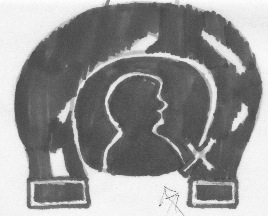


*Representation of where I'm from... Central Illinois: home of the Horseshoe (toast, ham, french fries, and cheese). The next time you're in the area, I highly suggest ordering one!
Logo Sketch-Idea #2 (Graphics Course)
My second representational logo--a little more straight forward to the viewer... Guess away!


*Starbucks Gingerbread Latte
Friday, August 20, 2010


Thursday, August 19, 2010
My Delicious Site Bookmarks
Click on the following link to check out the bookmarks I have tagged of various sites that I find beneficial whether it's for more knowledge about sustainability, visually pleasing images of masters and contemporary artists and designers, or exciting information I have found out about in the world of Interior Design.
http://www.delicious.com/katieparker.idesign
Of course, I have a link on this site to bring one back to this current blog! Check it out!!
http://www.delicious.com/katieparker.idesign
Of course, I have a link on this site to bring one back to this current blog! Check it out!!
Wednesday, August 18, 2010
Subscribe to:
Posts (Atom)